Do you remember the beautiful illustrations that were made for the original Pottermore? Atomhawk was the design studio behind all the visual design of the content, and also the two videogames “Book of Spells” and “Book of Potions.
We had the privilege of interviewing Ron Ashtiani, Head and Co-founder of Atomhawk and Creative Director for the Illustration work on Pottermore.
How was the process of designing the platform and the videogames? Can you tell fans a bit about that?
I joined the Pottermore project in 2010 and in the early concept stages with a focus on the visual design but also as a 20 year experienced game developer, I had input into the interactive elements as well. I worked on the project for almost 5 years! I also worked on the Playstation “Wonderbook” Book of Spells and Book of Potions projects but only in the visual design capacity as those projects were developed by Sony.
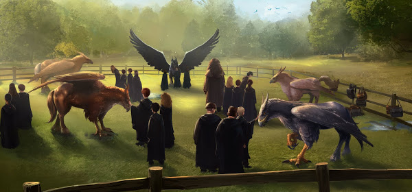
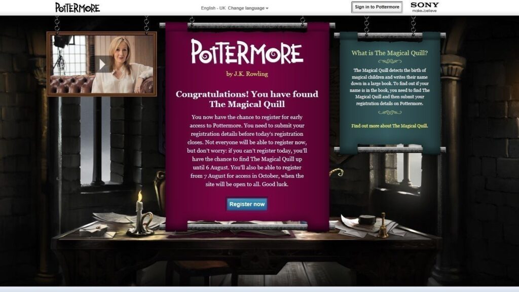
The first iteration of the Pottermore site was a very ambitious and creatively challenging project, nothing like it had been attempted on a web platform before. It featured interactive knowledge games/challenges that were based on the books. We all wanted it to be educational, connect people to J.K.Rowling’s world and figured the fans would like to be able to play rather than just read.
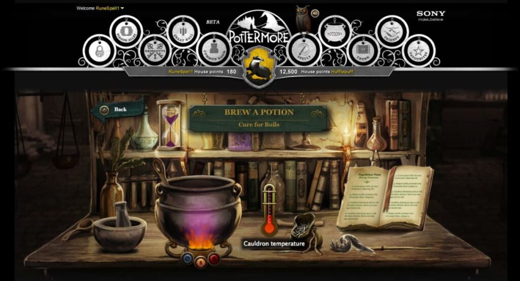
For example being sorted by the sorting hat, mixing a potion, gathering ingredients in herbology. The user journey would see users register on the site and take on a similar journey to students in Hogwarts. They would interact with the beautifully illustrated book content as they explored it. They would be sorted into a house and gain/lose house points. Contributing together to help their house win.
It was complex due to how many users would potentially access the Pottermore experience and wealth of content in the books. We also wanted to encourage user generated content to allow people to truly feel they had a stake in the platform.
The general aesthetics of Pottermore was very different from the Wizarding World we know (mainly movies, but also books artwork). Was that on purpose? Why?
The art direction was my main contribution. At the time I was the founder of an art studio called Atomhawk and we were doing illustration and concept design for a number of interesting projects. Films for Marvel, games for Warner Bros, to mention just a few. The Pottermore project wanted a different look, something more accessible, magical and crafted. A new look to attract fans of the books and have a less realistic feel, sort of like the images in your head as you read. There were technical reasons too, what works well in a movie (such as moody suggestive lighting, shadows) doesn’t work well for a scene that is interactive and requires the player to be able to see and click on objects. Also in the movies you see scenes unfold over time, but in websites back in 2010, video content was very slow to play back and relied on things like Flash player. So we invented a way to take a static image, cut up into layers that the players could zoom through and see all the content. This process worked much better on an illustration than a piece of video footage.
Did you work closely with J.K. Rowling on these projects, and if so, what was her input?
J.K. Rowling was certainly part of the process, as she is with all her projects. There were regular reviews on the project where she was involved. In my case, I was mainly focused on aesthetics but I am pleased to say that I met her.
Were there many alternatives that you considered for the main design and flow of the website?
As with all design processes, we went through many iterations and especially in the early versions. There is often a balance to be found between aesthetics, functionality, user experience and staying true to the original story. Hitting all of those elements in equal measure was challenging at times but fun.
The Pottermore website was designed mainly for large screen sizes (not mobile, for example). Did you ever consider a mobile version of Pottermore?
Back in 2010 mobile browser use was still very basic. The iPad was only released mid 2010 and up until that point mobile screens were very limited. Also web based graphical performance was poor, so at that time it wasn’t considered suited to mobile.
Why do you think fans are so nostalgic of the Pottermore website and from time to time start petitions to get it back?
I think it was a big and bold venture at the time, nothing like it had been attempted before and it did bring fans together. People interacted with the Harry Potter world directly with a sense of connection and community that is hard to find. There was a lot of interesting content on there that J.K.R wrote specifically for the platform, and it was beautiful to look at (at least I hope people feel that way).
What do you think of the fans who have tried to recreate it over the years?
Personally I think when fans try to recreate something it is the ultimate compliment, they loved it enough to want it to live on and are prepared to put their own time into it to make that happen.
And lastly, what’s your favourite section or design that you worked on each of these projects?
I think there are definitely areas that came out better than others (we were inventing a lot on the fly) The sorting hat game came out really well and fans loved that. The art was by my friend and co-founder Corlen Kruger and he did a great job. Also the illustrations we did for Book 3 in particular were of a very high standard. We had hit our stride by that point.