
Every hardcore fan of the Wizarding World is familiar with the Hogwarts Textbooks or Hogwarts Collection: the trilogy of books that comprise Quidditch Through the Ages, Fantastic Beasts and Where to Find Them and The Tales of Beedle the Bard. The first two, released back when the original series was not even completed, have their own story. And we talked with the person responsible for designing them and giving them life.
It was the year 2000 and Harry Potter and the Goblet of Fire had just been released in the United Kingdom and the United States (the first Harry Potter book to be released at the same time in both countries). Richard Curtis, writer and director of celebrated British films such as Four Weddings and a Funeral and Notting Hill, approached J.K. Rowling with a request. He had founded Comic Relief back in 1985 (a foundation to raise money to help poor people through comedy) and had the idea that the Harry Potter author could collaborate by donating a short story set in the Wizarding World to be auctioned off. He wasn’t very confident of Rowling responding: “I’m sure you won’t, we’ll still love your books, even if you don’t but just thought we’d ask” (Raincoast Interview with J.K. Rowling, 2001). But Rowling knew she wasn’t that comfortable with short stories, and so instead, she proposed to donate two short books from the Wizarding World: the Fantastic Beasts glossary, which Harry uses at Hogwarts, and the Quidditch textbook, the most checked-out book in the Hogwarts Library.
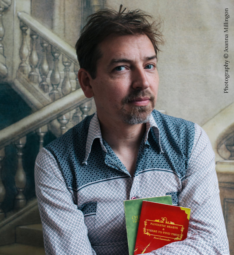
The two books, announced in October 2000, were finally published in March 2001 in English, with all the profits donated to Comic Relief. They are known as the green and red book, for their original and iconic design. The person responsible for this? Richard Horne.
“My name appears on some of your Harry Potter books and you probably never even knew it! I worked at Bloomsbury Publishing at the mid-point of Harry Potter’s Hogwarts journey”, Richard beings by saying. And although he was the one who worked on these two books, his story with Harry Potter starts before that.
Horne grew up in Yorkshire, England, and moved to London after finishing his graphic design studies. His first design position was at a company that produced record sleeves, but he soon realised that was not the industry he wanted to work (“‘Leave a Job You Hate’ ended up being the first entry I created in my 101 Things To Do Before You Die book, published in 2004”, he recalls). Then he worked freelance for newspapers and magazines, such as The Financial Times, Time Out and the Guardian, doing graphics and illustrations, until he landed a stable position at a company called RPM, where he worked designing greetings cards. Until one day someone mentioned that Bloomsbury was looking for a part-time designer. “I was in the right place at the right time.”
Richard Horne joined Bloomsbury at the end of July 1999, a few weeks after the publication of the third book in the series, Harry Potter and the Prisoner of Azkaban. “I hadn’t read the books at this point, I’d only just heard about the series due to the excitement within Bloomsbury. It was an awesome time to be in the company. My colleagues were great and although designing adverts wasn’t as creatively fulfilling as other things I wanted to be doing, working with the people at Bloomsbury made up for it,” he remembers when asked if he knew about Harry Potter before joining the company. “The job at that time meant I was working across the board on a wide range of books and campaigns, from adult fiction to children’s books, nonfiction and reference,” he adds.
His first experience with J.K. Rowling’s series was the fourth book, Harry Potter and the Goblet of Fire. The overall design for the books was already in place at that point: “Changing the design midway through the series wasn’t even a discussion. I’m not exactly sure who created the look of the series before I arrived, but up to then my role had been working on adverts, catalogues and point of sale. The opportunity to work on covers hadn’t arisen until this point.” But the fourth book was a bit different to the previous ones as well: “The secrecy surrounding anything to do with Harry Potter had escalated by the time the fourth book came along. The previous three books had had proof copies produced, but from the fourth book onwards there was no longer a need for proof copies.” He adds, “I don’t remember ever seeing the actual front cover artwork. As far as I remember, the illustration came to me already scanned.”
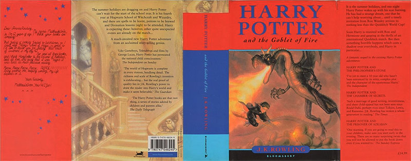
The secrecy was really high: “I couldn’t tell anyone what I was working on. I couldn’t even work on the cover within the Bloomsbury building, so I created the designs at home, with any meetings with the heads of Bloomsbury taking place in a corner of my bedroom in the flat I was sharing in Hackney. Even after signing the confidentiality agreement, I wasn’t given the book title until the last moments before printing. The design to this point read ‘Harry Potter and the ******* of *******’, until I received an email with only three words that read ‘Goblet of Fire’. Turns out I’d guessed the ‘of’ bit right.”
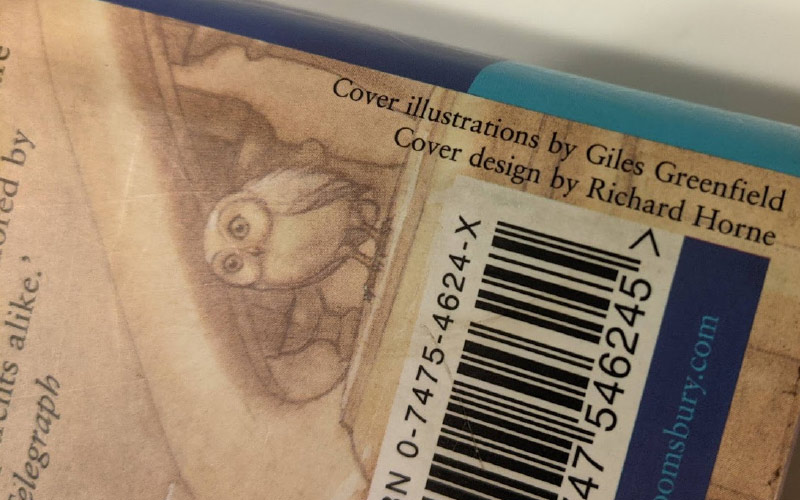
Richard Horne appears credited on the dust jacket of the book, and that was a decision taken by Emma Matthewson (editor) and Sarah Odedina (Head of Children’s at Bloomsbury) at the last minute. “This felt like a huge honour, although it confused my gran, who didn’t understand the concept of designing a cover. She asked me, ‘How long did it take you to draw the dragon?’ My answer was a big disappointment to her!”
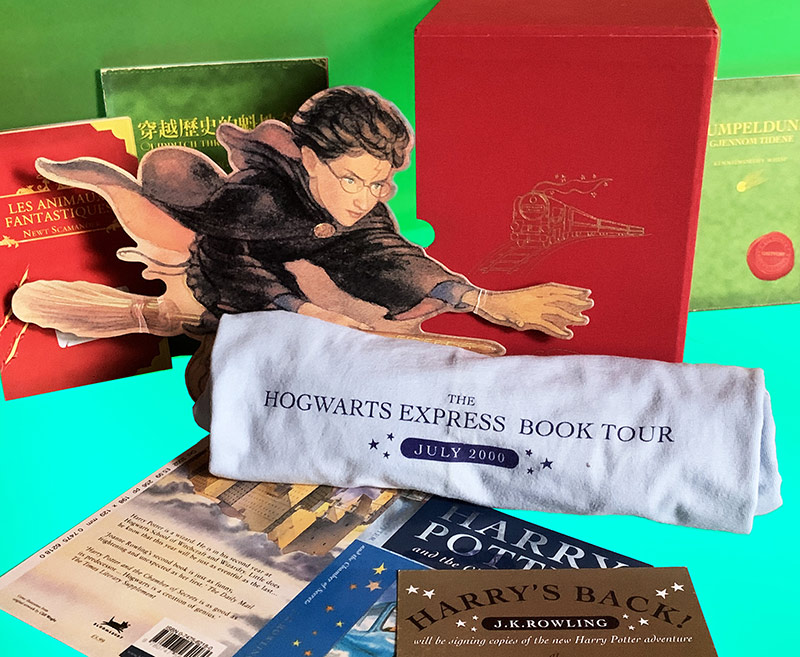
After the publication, Richard continued working on the Goblet of Fire, but on the marketing side. He worked on posters, bus adverts, t-shirts, invites, and specific ads for the Hogwarts Express tour, where Rowling signed copies of the book. He also worked on the box sets that were published at the time, producing an illustration of the Hogwarts Express that was also recently used in a Bloomsbury collection published in 2013.
But Richard’s legacy is more prominent on the first editions of Quidditch Through the Ages and Fantastic Beasts and Where to Find Them, which he designed completely. “It was Emma who approached me and asked if I wanted to be involved with the Fantastic Beasts and Quidditch covers. The answer was an immediate yes. I was sent home with copies of Jo’s original manuscripts for the books. I felt like everyone on the bus knew what I had in my bag. Of course they didn’t (apart from the possible Daily Prophet spies on the 38 bus route).” He also recalls that employing an external illustrator was not an option, as there were budget constraints. No one was paid, from Rowling to Richard, “when Comic Relief calls, you do your bit!”
The original editions for these two books were designed to look like real books from the Harry Potter world. While the Quidditch copy came with a library sign-out card and a stamp on its cover, Fantastic Beasts is Harry’s own book, with his and Ron’s annotations inside.
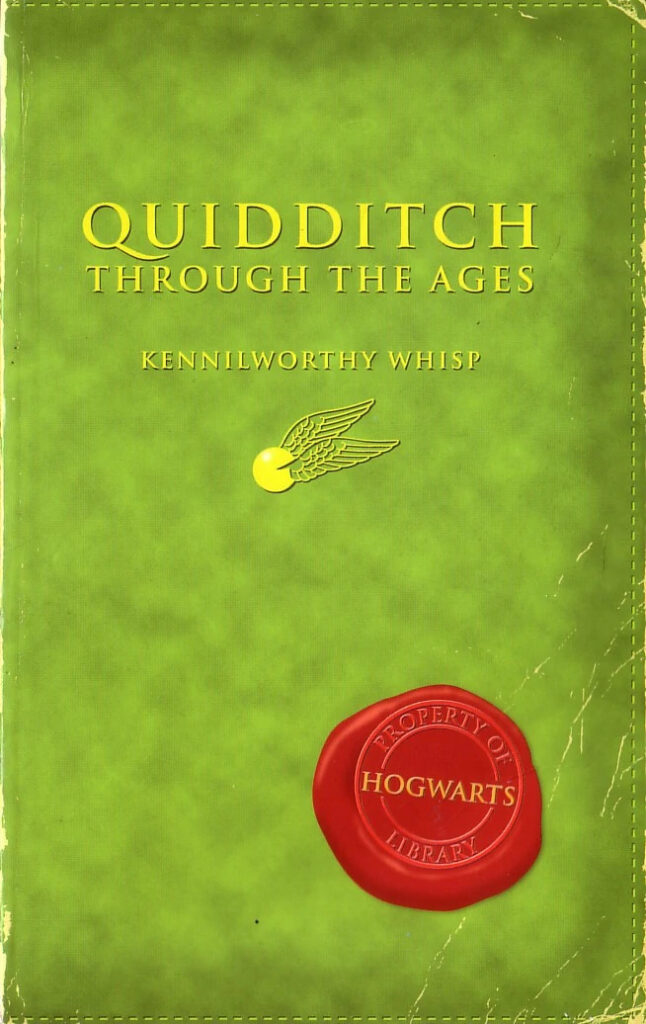
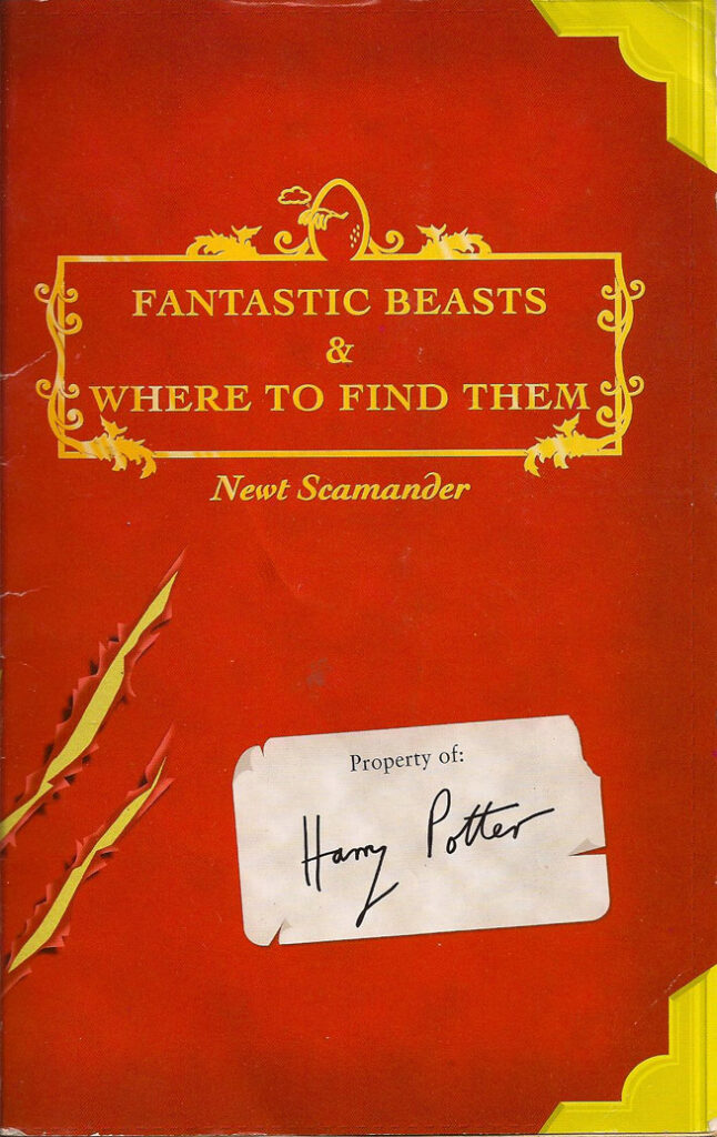
“I did think of a handful of illustrative ideas and routes for the covers to go in, but as the brief was simply ‘Hogwarts schoolbooks’, I tried to imagine what a Hogwarts textbook would actually look like, It wouldn’t be anything like the Harry Potter books already in circulation. I imagined it as a big, thick, heavy book, but there was no way I could replicate this in a small format with a thin spine, so I took the idea of leather bound elements and surmised that magical books would be more colourful than your standard antiquated, brown, real-world versions. I thought subtle references were the way to go – a snitch for Quidditch, the breaking egg and claw marks for Fantastic Beasts – with a nod to ownership in the form of Harry’s ‘this book belongs to’ sticker and the seal of Hogwarts Library. There were no major revisions to the cover design when shown to Jo and Emma, which was amazing to hear.”
The books are illustrated by J.K. Rowling herself, who also made the Harry and Ron annotations on Fantastic Beasts. But besides that, they also include some minor details like the library sign-out card, the in-world publisher’s name (Obscurus Books and Whizz Hard Books) and even the price of each copy in Wizarding Currency. Richard is able to confirm to us that “all that was Jo. She had it all planned.”
In the following months and years, the books were translated into dozens of languages: Finnish, Croatian, Czech, Dutch, French, German, Hungarian, Indonesian, Italian, Japanese, Norwegian, Polish, Portuguese, Slovak, Spanish, Swedish and Turkish, among others. And all of them used Richard’s original design. “Naively, I assumed that, as that the books were for Comic Relief, these would be UK only covers. But it turned out the design was used worldwide. And due to this interview, I’ve only just come to realise that at one time they may have held the record for the most repeated Harry Potter covers! I hadn’t been asked to create the covers with extended artwork or in various sizes for foreign territories, so each country used the exact layered UK files we used, and this is why the US edition (to my eyes at least) appears stretched. I hadn’t expected the artwork to be used on different sized books. I’d just assumed that each country would create their own artwork, as they did with the main Harry books,” he explains.
Over the years, some fans have questioned if these editions were meant to be 1:1 replicas of their in-universe counterparts. Richard has a particular take on this: “No way! These books are at least a third of the original size and length: they’ve been magically reduced for non-wizarding folk. Unfortunately that means we cannot access all the original content, only wizarding types can read the whole thing. We can only read a specially curated selection”, and he adds “the boring Muggle answer to your question is that both books were created for free by everyone involved and decisions were made to keep the costs down. And that would have included the production costs, which may have been largely absorbed by the printer.”
Just as Quidditch changed a lot through the years, these books changed over the years as well. They were republished several times, with different covers and inner designs (Rowling’s illustrations and annotations were removed too). About the editions that followed, Richard says “I really like Bloomsbury’s UK cover by Jonny Duddle with Tomislav Tomic’s superb interior illustrations. I also love the cover of the US Scholastic edition by Headcase Design, with the stylised dragon’s tail and the bugs. It really appeals to the designer in me”, but he is also proud because the other editions did not start to appear until ten years after the original publication: “In publishing terms, I think they had a pretty good run!”
Although he left Bloomsbury in October 2002, way before the publication of the Order of the Phoenix, he is still connected to Harry Potter. His wife, Helen Szirtes, is an editor who also worked on the series at Bloomsbury, and although she left to go freelance, she has continued to work on Harry Potter, most recently on the illustrated editions by Jim Kay. But that is not all for Richard: “There is a box in the cellar (my very own Chamber of Secrets) that has been reopened for this interview with all sorts of Harry bits that haven’t seen the light of day for these last 20 years …”
Many years have passed since Richard Horne worked on these two wizarding books that clearly defined an era for the Harry Potter phenomenon. They were the first Harry Potter spinoffs and one of them even inspired the Fantastic Beasts film series. Since their publication back in March 2000, the fandom has pored over them, trying to look for every tiny detail, and even today these books still trigger conversations that go from canon analysis to Rowling’s inspirations. As Richard himself says, “I love that these books have been thought about so deeply!”, and we love it too.
You can follow Richard on Instagram (@elhornogram) or visit his website www.elhorno.co.uk