Phil Bates is an award-winning designer who worked as a senior art director for major broadcasting and cable networks, motion picture production companies, music labels, and design firms that support the industry. You probably saw a film poster made by him, and among his clients are big corporations like Fox or Warner Bros. In 2009, he was added to the Art Institute of Colorado’s Hall of Fame.
Recently, he shared some posters he worked on for the first Harry Potter film: Harry Potter and the Philosopher’s Stone (Harry Potter and the Sorcerer’s Stone in the United States). Although these film posters had never seen the light of day until now, they are proof of all the unknown work behind the Harry Potter films (and especially the first one). We had the chance to talk to Mr. Bates, we asked him a few questions about the creative process and how he worked on the posters, which despite not having been used, they did serve as an inspiration for the ones that were chosen by Warner Bros. and are known at a worldwide level.
How were you approached to do this job? Did you know Harry Potter at the time, or was it an unknown saga for you?
I was working for a design agency and we were given the project of working on the international campaign for the first film. I was so excited, as I had read the books and was a huge fan.
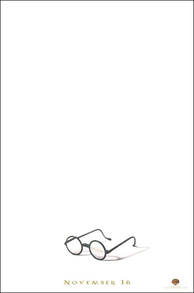
The first poster is very iconic, and now it is easy to associate the rounded glasses to Harry Potter, but at the time it could have been risky (they may have been associated with John Lennon). How did you take that decision?
I did worry that people would associate the glasses as “John Lennon glasses”, but I figured that Harry Potter was such a huge phenomenon and so widely known that people would recognize them from the book art, plus I used the font from the books for NOVEMBER and put the logo as a reflection in the glasses. But in the end, it was too risky for them to have this be the first art for the movie series, even as a teaser poster.
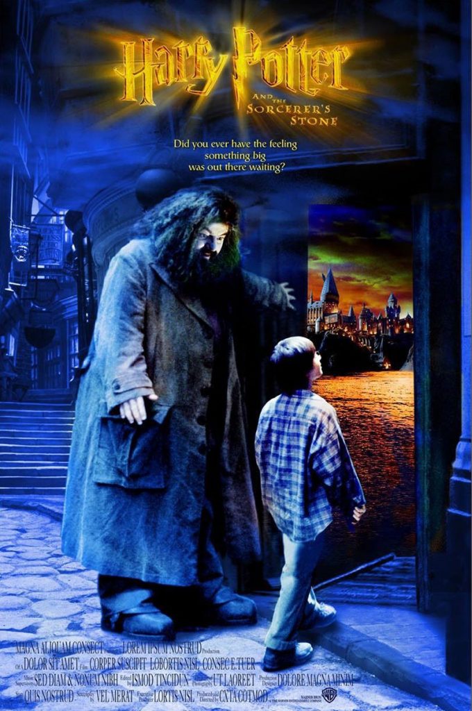
Why did you choose to include Hagrid showing the Wizarding World to Harry Potter for the second one?
To me, Hagrid showing the Wizarding World to Harry was an iconic moment in the first book. Of course, he showed Harry Diagon Alley, not Hogwarts, even though he was with Harry when they arrived at Hogwarts. But that moment in Diagon Alley always stood out to me, because not only Harry but the reader is also introduced to the magic world. I thought it made a great moment and poster, but they didn’t shoot that idea and we didn’t have the right photography to support it. I pieced that together from many unit photography shots but it just wasn’t high enough quality to go any further than a comp and we couldn’t find the right expression of Harry and needed to see his face a bit more.
Were you able to watch the film before working on posters, or you were provided with the material?
We didn’t get to watch the film but we were able to read the script and I was thrilled that they stuck very closely to the book. Plus we got to go through tons of unit (on set) photography which really gave a pretty good picture of how the film looked. It was exciting!
Did you choose the taglines and slogans that appear on the posters? Any special reason for them?
We had copy written and I did choose the lines for the comps you saw. People seeing the movie probably read the book, or at the very least they knew the story, so I didn’t feel any pressure to tell a story with the copy. I just wanted to create a mood and give people seeing the art something to be excited about.
Do you know why Warner Bros. decided not to use them widely?
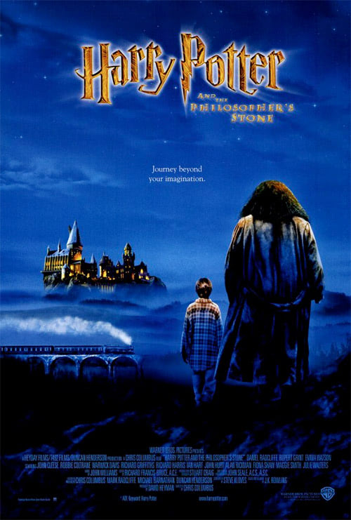
The art they went with is below, which was designed by another art director at the design firm. It had the same feel as the art of Hagrid showing Harry Diagon Alley but this art had a lot more scope and looked bigger, more magical. It was a nice way of introducing the film to the millions of Harry Potter fans around the world. We also did a theater display that showed Harry looking into the Mirror of Erised. And the mirror portion of the standee was a lenticular design and showed different things when you viewed it from different angles. It was pretty cool.