
It seemed strange that Harry Potter’s publishers hadn’t turned to one of the classical strategies in the editorial world when it comes to a book of such big success. The illustrated editions of J.K. Rowling’s books were something that the fans had been asking for years, and their delay was never fully understood. Perhaps the publishing houses realized this when they noticed how much the fans praised the illustrations that came with the initial version of Pottermore, a site where the users could explore each “moment” of the book together with a background drawing. It’s true, though, that they were worth the wait.
Nearly three years ago, in December 2013, Bloomsbury announced what we now know as the illustrated books, although we did not know what to actually expect back then. A short announcement stated that the first book would come out in 2015, that they would be published annually (which so far has been the case, but we have yet to see what happens from now on) and that the artist tasked with this enormous challenge would be Jim Kay, who had been awarded with the Kate Greenaway Medal for his illustrations in Patrick Ness’, A Monster Calls.
For once we believed that they were not trying to take money out of our pockets and exploit us (like it sometimes seemed to be the case with so many other new editions that simply have different covers yet nothing new inside.) This announcement was something interesting but that, unfortunately, was still far away from being able to be appreciated. A simple sketch in which we saw the Magical World’s most famous child also accompanied the announcement.
Within the two years that followed we were able to see promotional pictures, an actual size cover of the book and interviews with the artist (and glimpses of his study), and it was only after these two years that we finally had in our hands the first Harry Potter illustrated edition. And just like the excitement grew and reached its peak in September 2015, so did the reviews: the book’s reception couldn’t have been warmer. Jim Kay’s drawings had everything: they brought back feelings, memories, and they allowed us to explore the book’s world from a point of view that the movies lacked. By mixing imagination with the nostalgia of the book’s first reading (which for many of us was years ago), the colours and the lines are much closer to the literature and the feelings that reading provokes than they are to the CGI effects and soundtracks.
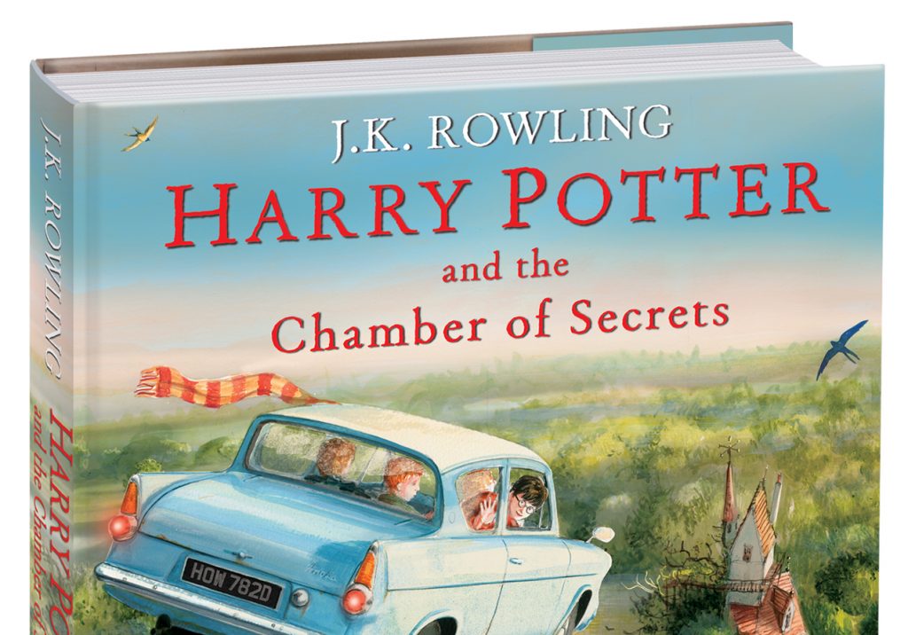
And now, a year after we had the experience of opening a Harry Potter book to see the illustrations drawn by a great artist, comes the second book. The illustrated edition of Harry Potter and the Chamber of Secrets, however, does not produce quite the same effect as the first one did.
It is possible that the surprise factor is no longer working. The feeling of opening that book for the first time to see J.K. Rowling’s words surrounded by Jim Kay’s drawings, making us feel that same nostalgia is difficult to imitate. Maybe it is a mistake to look for it in this second book.
The text, in comparison to the first one, does not help as well. Whilst in Harry Potter and the Philosopher’s Stone everything is new — as we are discovering everything along with Harry — in Chamber of Secrets there are even fewer things to discover. Knocturn Alley is new, as is the Burrow, but Hogwarts and its sceneries are something that we have already seen. Same thing happens to most of the characters. This plays a little against the creativity of the team behind these books, since it makes it harder to choose what to illustrate, as it has to appear new and interesting to the plot.
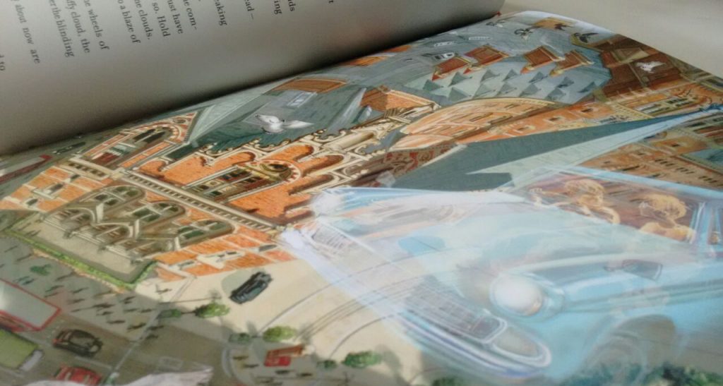
Jim Kay’s talent, nonetheless, manages to avoid this problem and stays at its highest. The illustrations have and exceptional quality — and he very well might be the best illustrator that has passed through any copy of Harry Potter (sorry Jason Crockfort, among many others!) Some double page drawings to point out: Harry playing Quidditch and Harry going into Tom Riddle’s diary.
The effect of the pages with the dark background and white letters is better executed in this book than the previous one, especially in scenes where the darkness is tangible through the text (like Knocturn Alley and the Chamber of Secrets). We hope that the next books also add this type of games in which the illustrations and the text blend together to create atmospheres. Reading these scenes with a black background causes a different sensation. Could something similar happen to the underwater scenes in Harry Potter and the Goblet of Fire?
Maybe it was an editorial decision, or perhaps is was a matter of time, but despite being longer, Chamber of Secrets has less illustration than Philosopher’s Stone (around 80, while the first one has 100.) This can be seen in the first book, where there are few, 2 or 3 pages, without illustrations. In the second book, once can see 4 or 5 pages several times where there is only text and no illustrations.
We do not know why, but it triggers a few questions. The time between edition and edition – a year – limits the number of the illustrations that Jim Kay can produce. If this remains the same for future editions (as it was announced in the original press release), what will happen with the upcoming books? The difference of length between the first two books is not that much, and even with fewer illustrations Chamber of Secrets is a good product, but what about Prisoner of Azkaban? And with Goblet of Fire? With 90 illustrations it would be one every ten pages, approximately. And considering that Order of the Phoenix is the following book, Bloomsbury should start thinking about it soon.
A solution could be to wait more than a year between books. This would give Jim Kay enough time to work on all the needed illustrations, without the calendar pushing him. Though this would delay the schedule for Bloomsbury and Scholastic, considering the franchise still has five more movies, that would not be a problem for the publishing houses because we still have room for Harry Potter in the market for a few years.
Another solution, maybe for the eager fans, would be to divide each novel in volumes, and to publish one per year. Fans will possibly complain, a similar behaviour we saw for the film adaptation of Harry Potter and the Deathly Hallows. Let’s not forget that this scenario would be very good for the publishers: they would sell each book more than once (that’s honestly what they want after all), but it would also be a risky move, and they do not want the hatred of the fans.
We will see what happens in the following editions. Just for now, let’s enjoy Jim Kay and his magnificent art that surrounds J.K. Rowling’s books, and especially this last one, Harry Potter and the Chamber of Secrets out this past October. Despite the sensation of being too short, and that the artwork can’t generate the same surprises than the first time, it is still a great product, which it is up for what the Harry Potter series deserves, and which any fan should consider adding to his library.
One final point, perhaps for the not nostalgic ones or those who have read the books recently: these illustrated editions do not add much, as they are based on feelings and the ability to generate emotions with the new artwork included. To those of us who grew up with books, the images evoke us to earlier times, but there are others that can enjoy the illustrated editions as much as we do: little children. There seems to be no better way for a child to approach J.K. Rowling’s texts than with these new releases. The two ends, older generations who approached the texts long ago, and kids who have still not read them, are the perfect readers for this new way of packaging the story.
We will hardly know how these editions might have looked with another illustrator, had the editorial decision been different. We do celebrate that it was the right decision — and that we still have five (as a minimum!) books to look forward to and enjoy with what imagination and Jim Kay’s talent wish to give us.